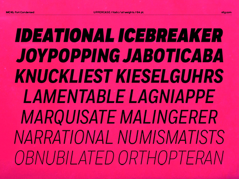
2014 font Fort Condensed by Village.
Jeremy Mickel: “I first ‘completed’ the new widths of Fort for AFAR magazine, but rethought the range of widths shortly after. I decided my Condensed wasn’t narrow enough to really differentiate from the regular width. I also redrew many of the characters, realizing that as a font gets more condensed, open forms like the C G S need to close up more, otherwise feeling too open. I cut the middle width and create a much narrower version and named that ‘XCondensed’.
AFAR wanted italics for all the styles, and I debated whether to draw italics for the new XCondensed weight. Almost on a dare from a type-designer friend, I knuckled through it and drew the italics for all the widths. It would have felt unbalanced not to, and in the end, I’m glad I made them. I think narrow italics can be useful, and are a worthwhile addition to an underserved part of the typographic spectrum.”
5 hearts